Career Connect Canada

Our Process
Take a closer look at how we tackled problems along the way, came up with new ideas, and made solutions that led us to our final product.
Goals for Our App
Based on our team’s personal objective and our audience we had 3 goals in mind that we wanted to achieve with our app.
Finalization For Final App
Based on feedback from our TA and user interviews, the 3 areas our group need to focus on most going forward were:
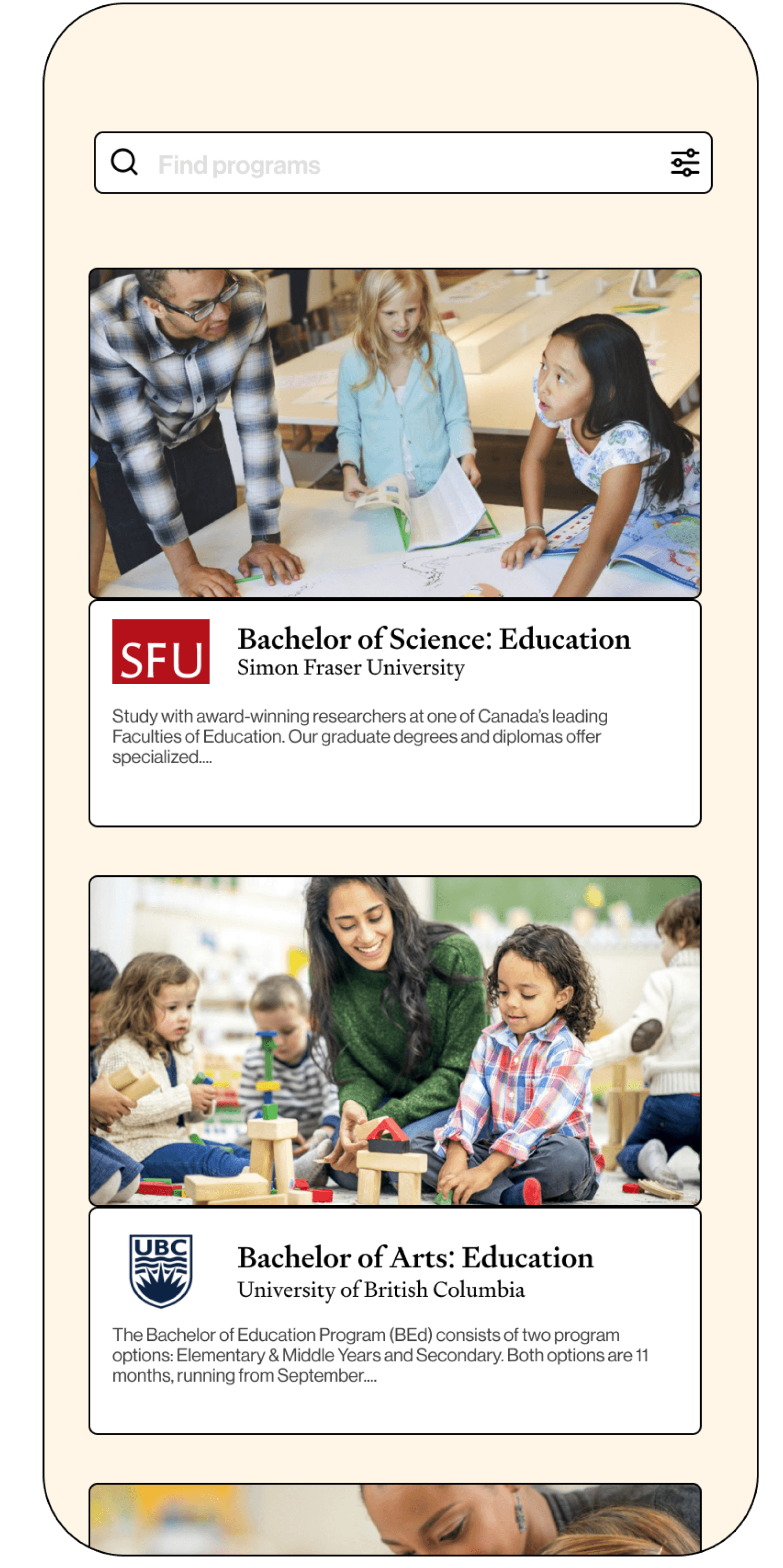
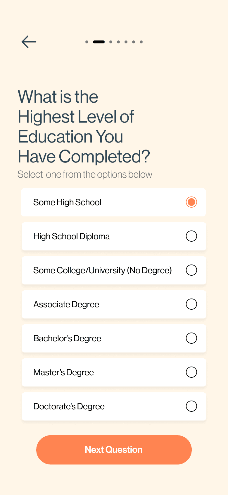
Our team set out to design an app called Career Connect Canada, aimed at supporting international students as they adapt to life in Canada. The app leverages AI to bridge the gap between students' past educational and professional experiences and the most suitable educational programs available in Vancouver, helping them transition and make informed choices for their future.
Our Team’s Objective
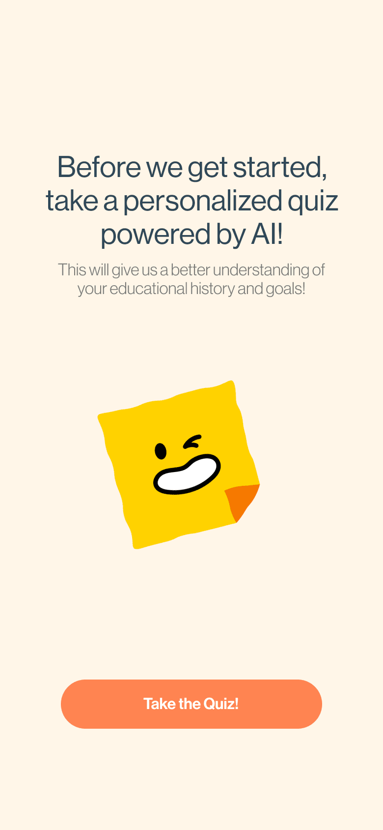
Why use AI in the First Place?
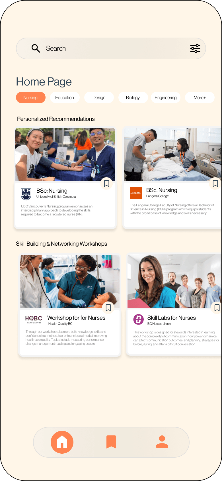
Our main stakeholders were older international students seeking a second degree, often needing help to match their past experiences with programs in Canada. The app simplifies this process with tailored recommendations.
C3 can also cater to younger international students starting their first degrees and domestic students exploring programs, offering personalized guidance for diverse academic needs.
Considering Our Audience
Initial Sketches and Style
International Students
With this in mind, our group started ideating!


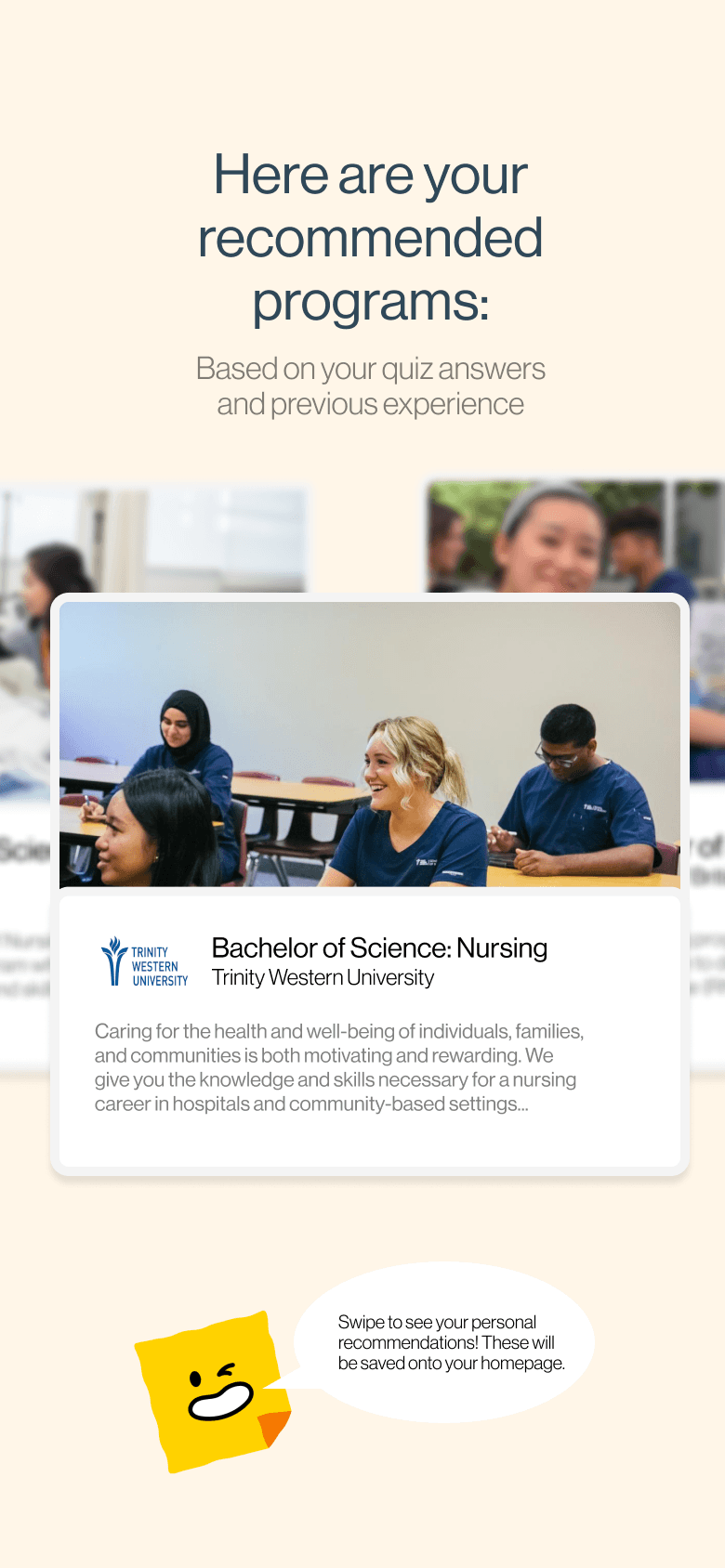
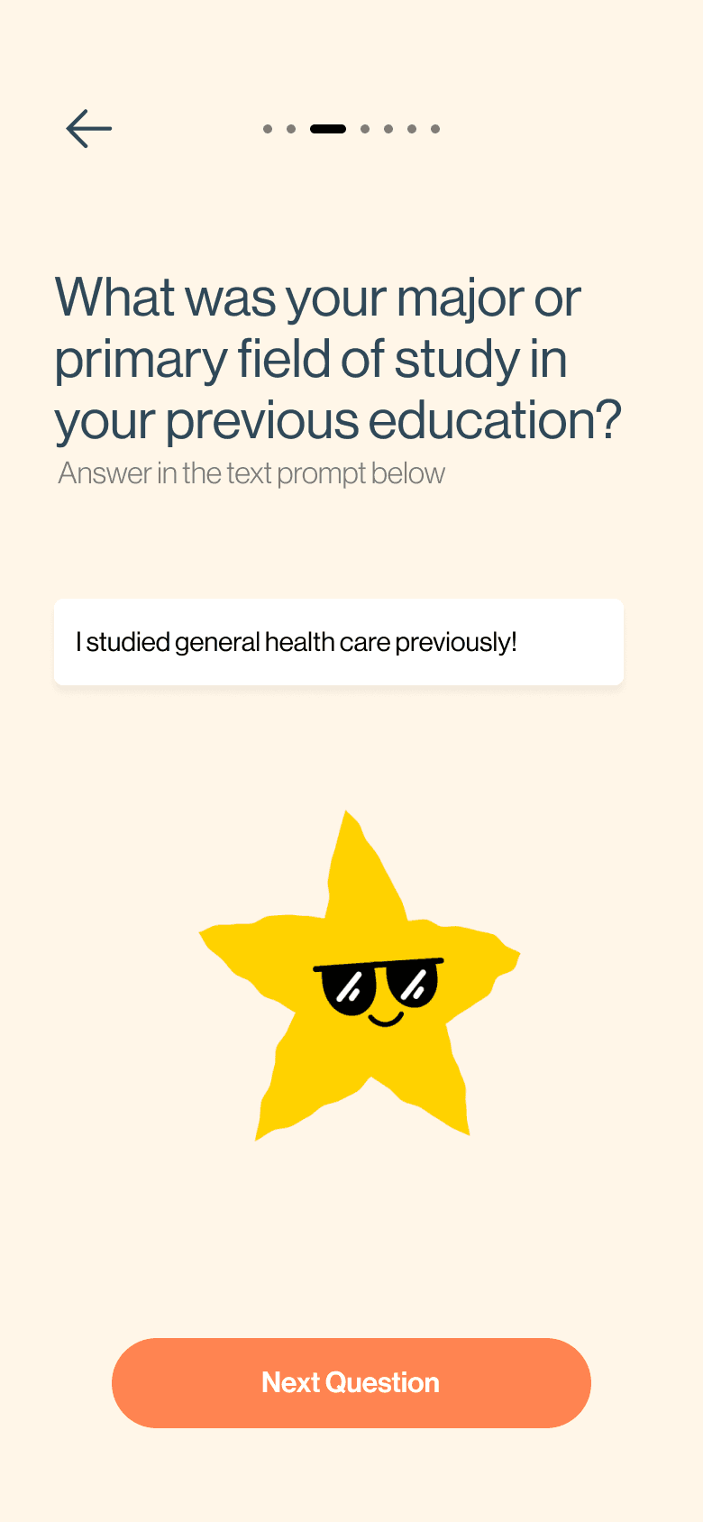
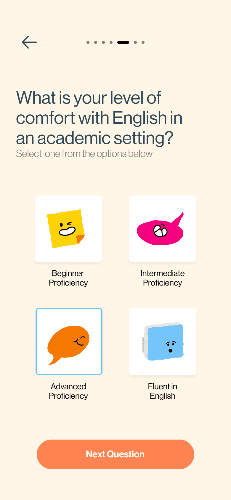
It powers the initial onboarding quiz, helping users quickly identify programs that align with their goals and backgrounds.
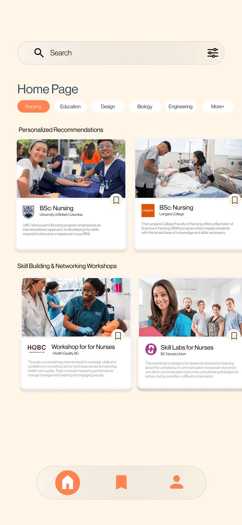
It customizes the homepage based on user preferences, ensuring an intuitive experience for every individual.
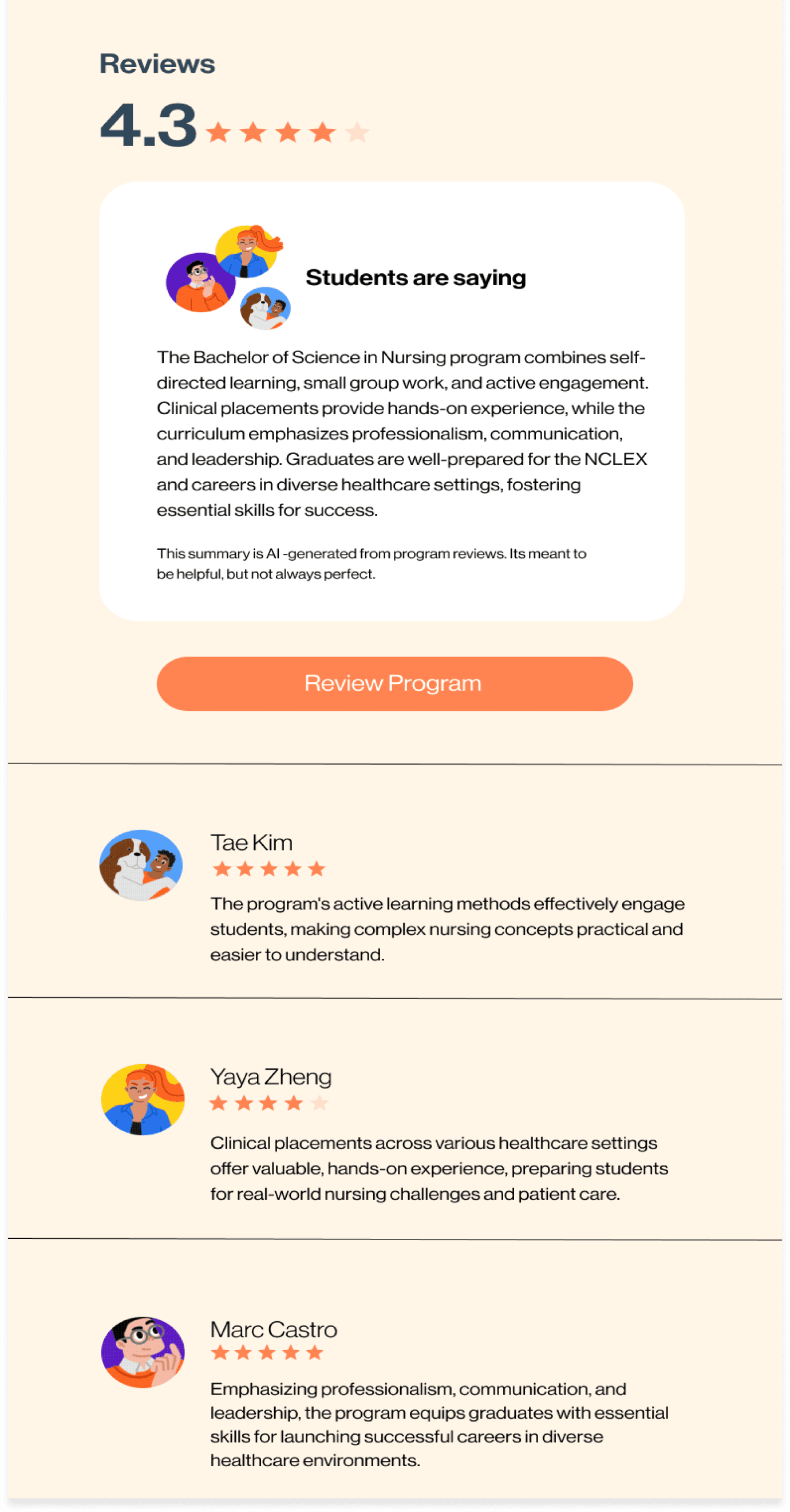
It also summarizes user reviews, providing a faster alternative into making an opinion on the respective program.
Our group recognized AI as a powerful tool that can greatly enhance user experiences in today’s digital world. With its ability to analyze data quickly and provide personalized recommendations, AI became central to our app's design. We wanted to incorporate it into multiple features to ensure that users received the most relevant, tailored assistance.
User Testing With Our Prototype
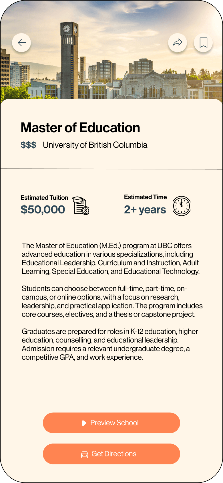
User testing played a crucial role in refining our app by highlighting key areas for improvement. Participants provided valuable feedback that guided us in addressing concerns such as unclear button functionality, insufficient information on program cards, and the lack of a direct program comparison feature. These insights helped us prioritize features and make targeted changes, such as incorporating more detailed program cards, enhancing navigation, and integrating new features like social reviews ultimately making the app more user-friendly and accessible.
Make it easier for all students to discover the best educational programs that suits their needs.
Use AI to provide recommendations to streamline the decision-making process.
Offer workshops and events to help connect with peers and professionals in their field.
Discover Programs
Foster Connection
Foster Connection
Make it more easier for students to enhance navigation on the programs cards.
Having a direct way to compare programs would further help students seek out the best option.
Adding reviews to the card would further help students make a decision on the best program.
Changing Cards
Add Reviews
Comparison Feature
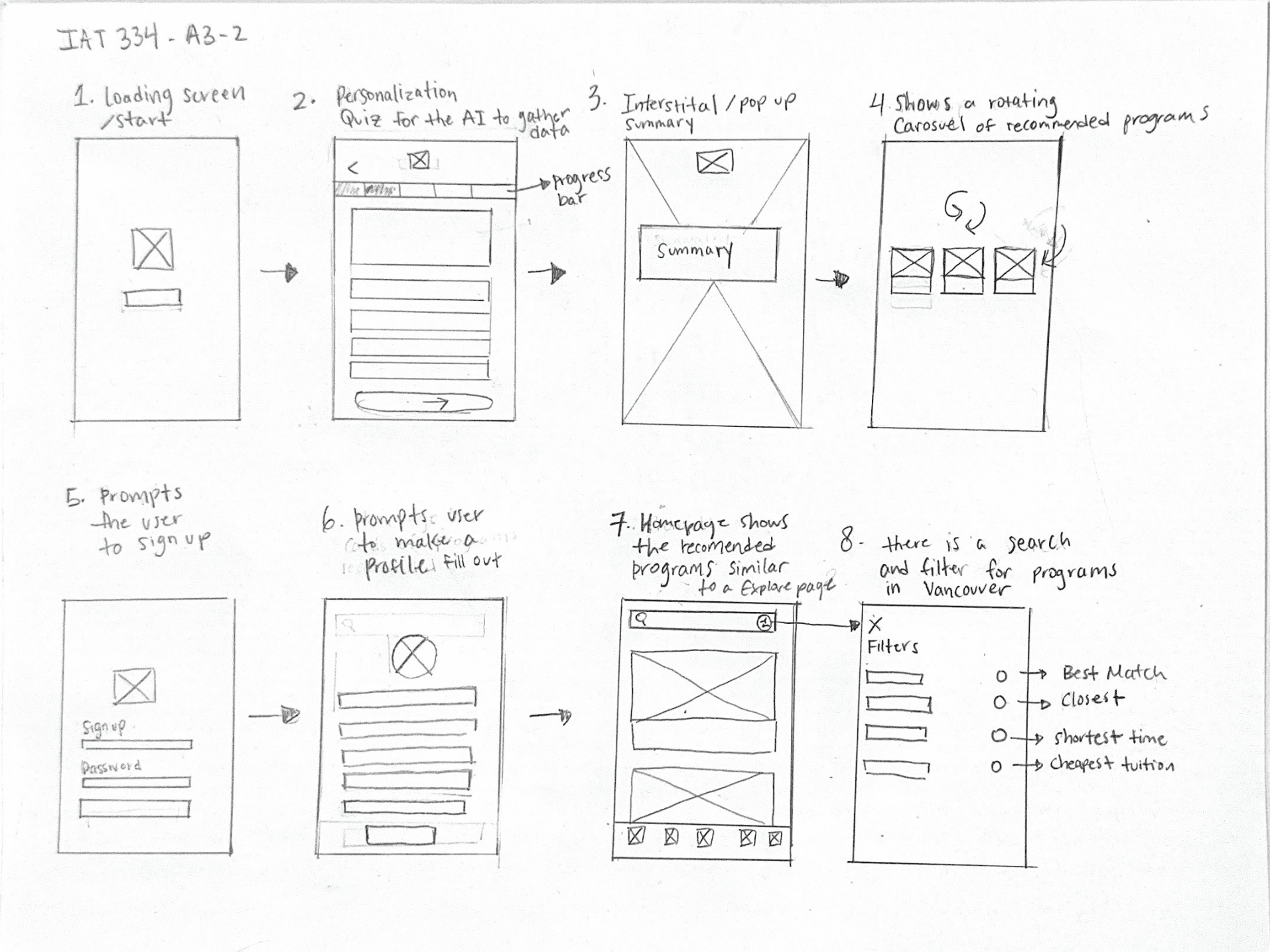
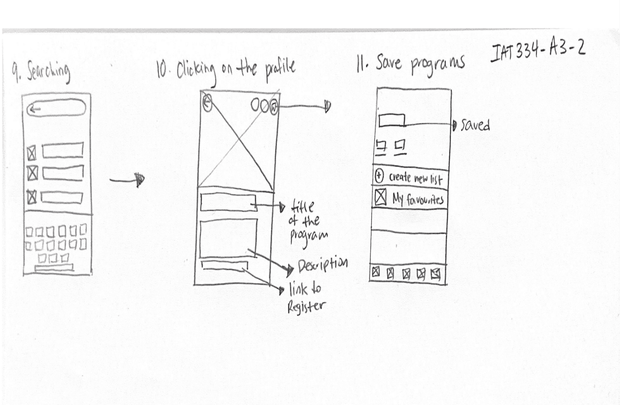
Our initial sketches were created with a clear focus on the key features we wanted to include in the app. These sketches served as a blueprint for organizing and visualizing the user experience, helping us decide on the layout and flow of important elements like the onboarding quiz, personalized recommendations, and program search. We continued to refine and iterate on these initial designs throughout the development process, adjusting based on feedback and testing.
First Few Iterations
In the first few iterations of our app, we found the design to be too linear and flat because there was essentially only one user flow. This meant users were following a fixed, rigid path without room for exploration or flexibility. Elements like the program cards lacked visual depth and interactivity, making them feel static and unengaging. The design didn’t offer clear indications of how users could interact with these elements, which made the experience feel one-dimensional.
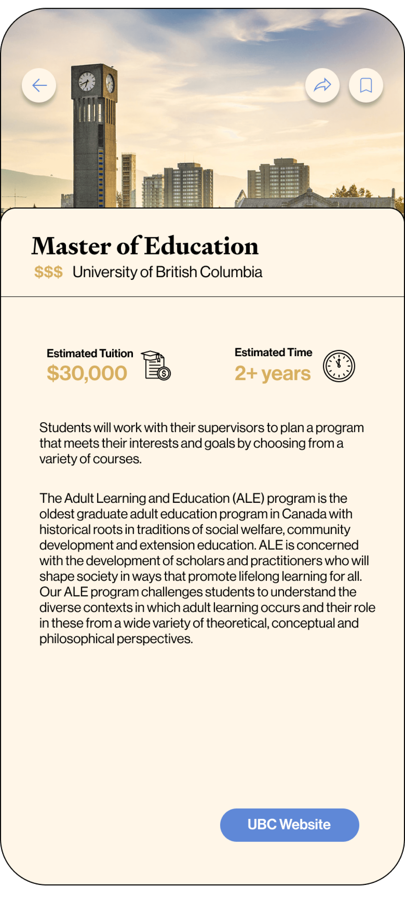
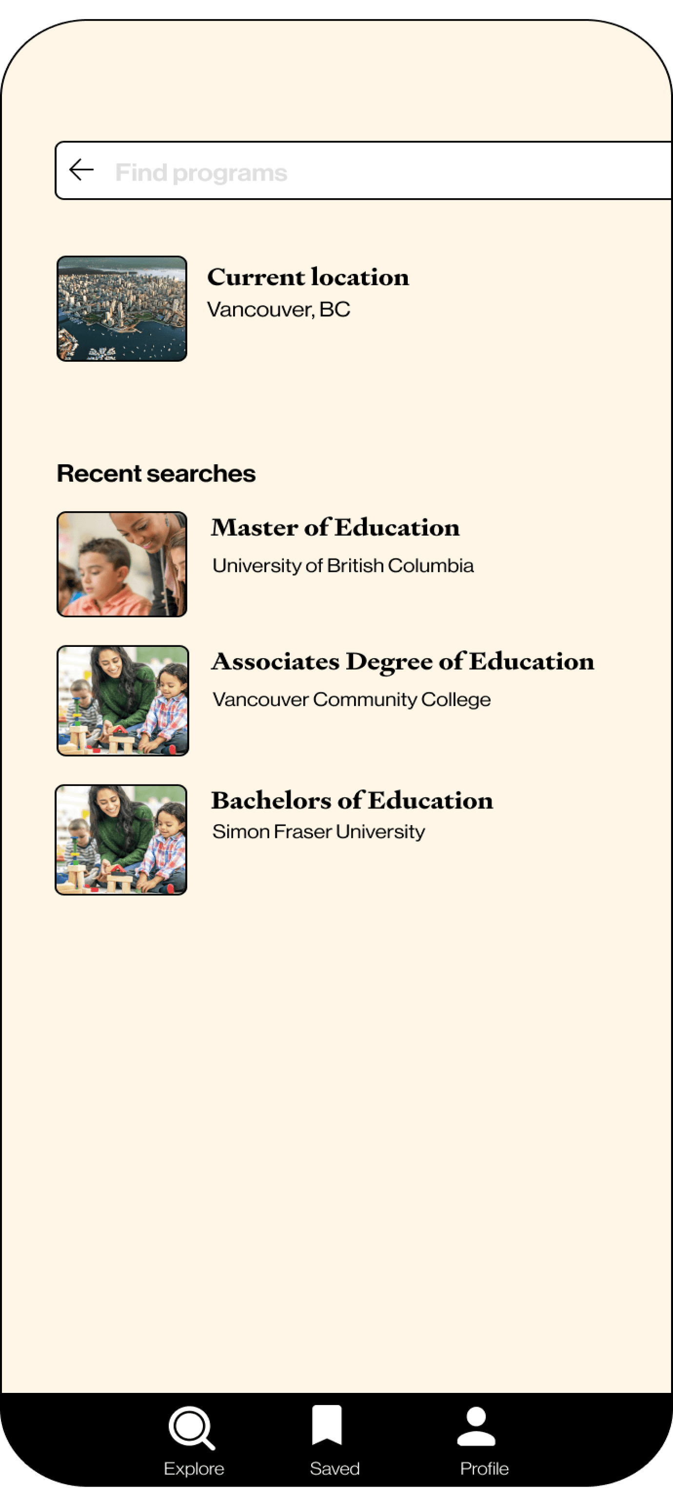
Changes Made
To address this, we added borders and drop shadows to the cards, which helped create a sense of depth and made the interface feel more interactive. These design tweaks allowed users to better differentiate between elements and understand how to engage with them. To tackle the issue of the flow being too linear, we introduced several new features, including a save feature to bookmark programs of interest. These additions provided users with more flexibility and control over their navigation. Additionally, we noticed accessibility issues with our original color palette, particularly with the yellow used as a tertiary color.